 |
 |
 |
 |
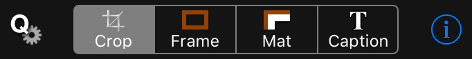
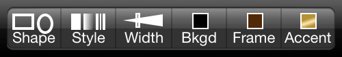
The top tool bar controls the main modes of Crop'n'Frame™. You can simply crop a photo, or just add a caption. You can crop it and then proceed to add a frame, mat, and/or caption. Or you can design a frame and mat first, and then go back to crop the image while viewing it in your frame. The Q* button is used to access QuickSets, a quick way to load and save your favorite settings or factory presets. The i button is used to view these instructions and change preference settings. The bottom tool bar varies from mode to mode, but it always includes these two buttons:
Note that if you use a transparent background, when you save or share your framed photo, PNG format will be used to preserve that transparency. Also note that PNG files are larger than JPEG files. Tip: After you save a finished photo, you can reload that saved photo to combine effects (double mat, multi-line caption, multi-color frame, etc.).
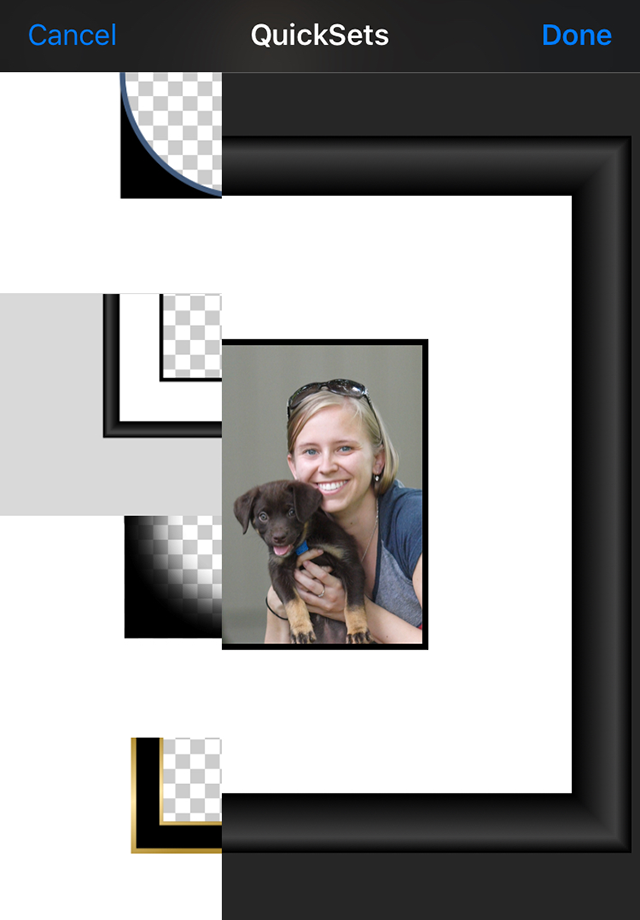
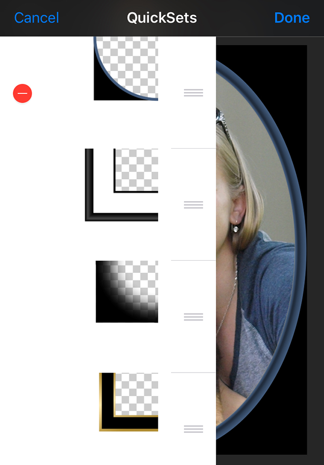
To view the available QuickSets, tap the Q* button. The scrolling list that appears displays a representation of each QuickSet. Tap any item to preview those settings with your photo. Tap Done to actually apply the settings, or Cancel to exit without applying the changes. To add a QuickSet that saves your current settings for future use, tap Q* and then tap +. A representation of the current settings will be added to the top of the scrolling list. Tap Done to save the new list, or Cancel to exit without changing the QuickSet list. To remove a QuickSet or reorder the list, tap Q* and tap Edit. To remove an item, tap the - next to the QuickSet that you want to delete, and then tap the Delete button that appears. Note that you can't delete the built-in QuickSets. To reorder the list, drag the = next to a QuickSet to a new place in the list. You can delete and/or reposition any number of items this way. When you are finished, tap Done to save your changes, or Cancel to restore the starting list. You can also exit QuickSets at any time by tapping outside of the QuickSet list.
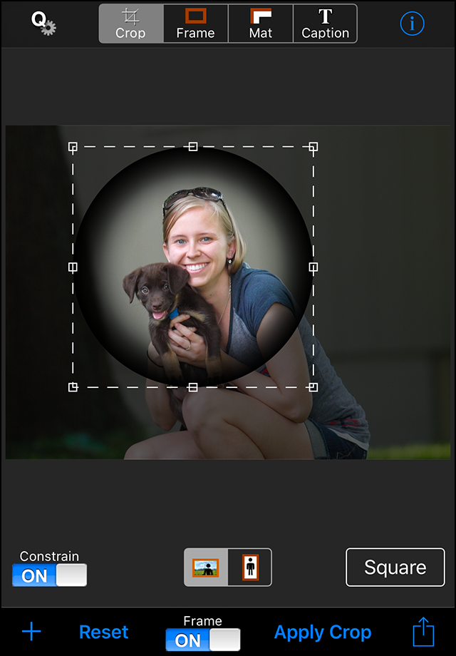
If the Frame switch is on, the current frame and mat will be displayed as you adjust the crop rectangle. When you press the Apply Crop button, the portions of the original image that are outside the rectangle will be cropped out of the picture. (If you don't apply the crop, it will be applied for you when you switch to frame or mat mode, or when you save the image. When you press the Reset button, any crop that has been applied will be undone. If a crop hasn't been applied, the active crop rectangle will be reset to cover the largest area possible, considering any aspect ratio constraints. 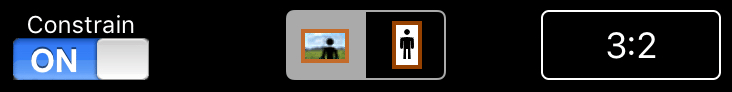
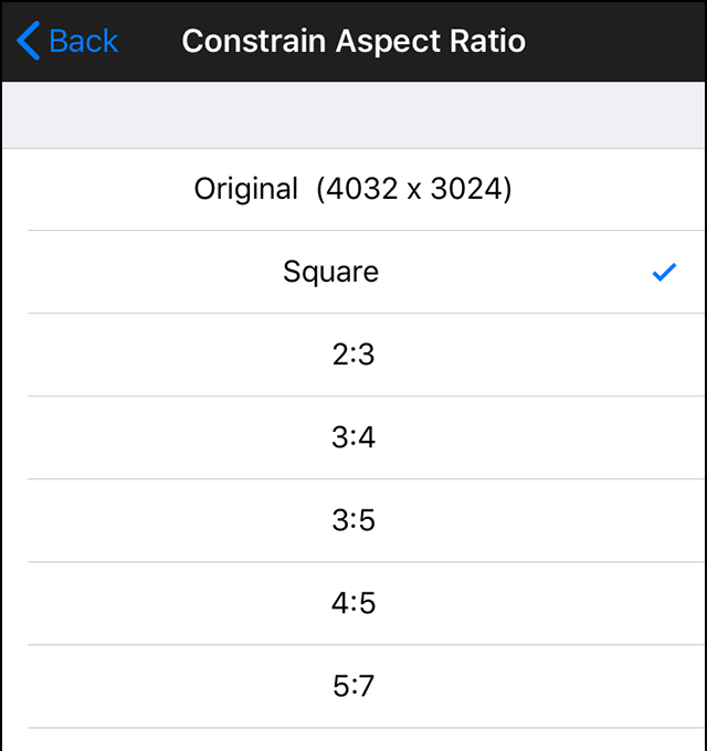
Leave the Constrain switch off unless you care about the aspect ratio of the image. If you turn the switch on, the button on the right will display the currently selected aspect ratio constraint, and you can press the button to select a different ratio from the table that appears. You can also specify whether the constraint should be applied in landscape or portrait mode. It is important to note that since the width of the frame and mat are the same on all sides of the image, the crop rectangle has a different aspect ratio than the framed image (unless the aspect ratio is square, 1 x 1). When the Frame switch is on, the dimensions of the framed image will be constrained to the specified aspect ratio, and when it is off, the dimensions of the crop rectangle will be constrained. Changing the frame or mat width will change the aspect ratio of the framed image, so if the framed image dimensions are important, you should design the frame and mat first, then return to Crop mode and with the Frame switch on, size and position the crop rectangle.
To change the shape, simply tap the shape icon, and then one of the shapes that appear.
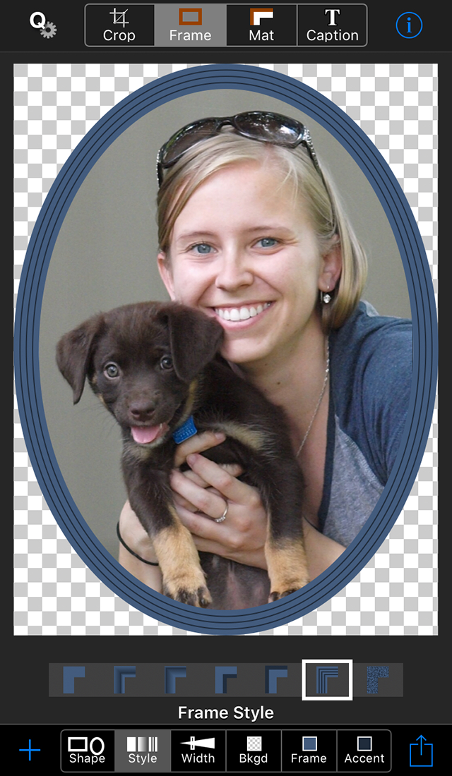
Press the style icon to choose one of seven styles.
When you press the width icon, this slider appears:
You can specify the background color (which may be transparent, represented by a checkerboard), the frame color, and the frame accent color. The background color will be visible only with non-rectangular frame shapes, and the frame and mat accent colors are not used for all styles. The color picker that is used for all color selections is described below.
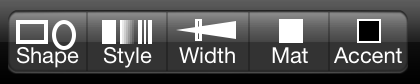 You can choose any mat shape, regardless of the frame shape you have selected, but some shape combinations are more useful than others.
For example, an oval mat in a rectangular frame is fairly common, but a rectangular mat doesn't fit well in a heart shaped frame.
You can choose any mat shape, regardless of the frame shape you have selected, but some shape combinations are more useful than others.
For example, an oval mat in a rectangular frame is fairly common, but a rectangular mat doesn't fit well in a heart shaped frame.
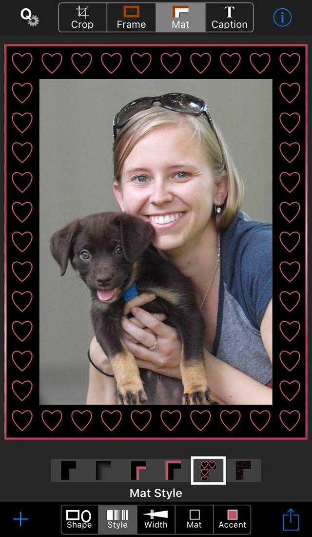
 There are six mat styles, the first drawn with only the main mat color, the second drawn with the main mat color at varying opacity levels,
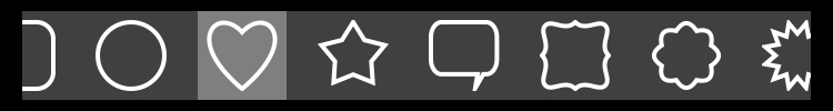
and the rest use the main mat color and the mat accent color. When you select the fifth style, a list of confetti shapes will be displayed so
that you can choose a shape to be drawn as a pattern in the mat. You can specify whether the chosen shape is filled or outlined, and there is a slider to control the shape size.
When you select the sixth style, a list of textures for you to choose from will be displayed.
There are six mat styles, the first drawn with only the main mat color, the second drawn with the main mat color at varying opacity levels,
and the rest use the main mat color and the mat accent color. When you select the fifth style, a list of confetti shapes will be displayed so
that you can choose a shape to be drawn as a pattern in the mat. You can specify whether the chosen shape is filled or outlined, and there is a slider to control the shape size.
When you select the sixth style, a list of textures for you to choose from will be displayed.
You select the color of the mat and its accent color with the color picker described below. Tip: To create a vignette, choose the gradient mat style (the second one), set the mat color to the background color, and set the frame width to zero.
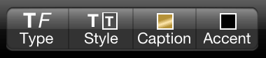
The toolbar icons are used to enter text, and to choose a font, style, color and accent color.
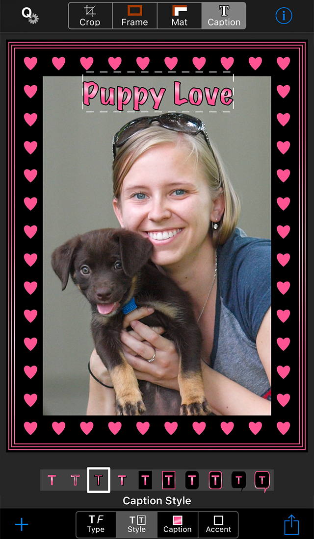
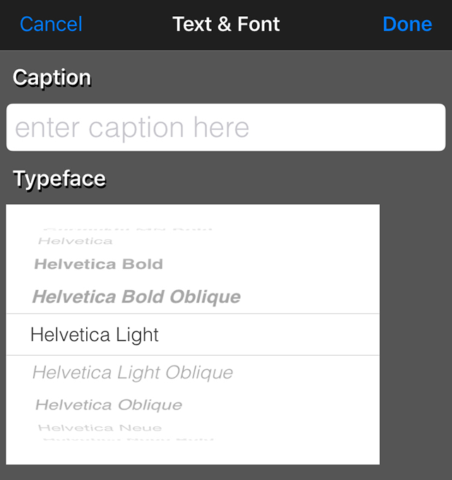
To add or edit a caption, tap the Type icon and enter the text in the Caption field and choose a font from the Typeface list.
To remove the caption, delete the characters from the Caption field.
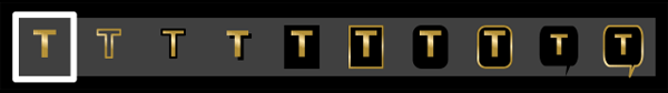
There are ten caption styles, including outlined text and speech balloons.
You select the color of the caption and its accent color with the color picker described below. Tip: Captions are limited to one line of text, but you can create a multi-line caption by saving the photo with first line of the caption, selecting the saved photo and adding the next line of the caption. The same color picker is used to choose the background color, frame color, frame accent color, mat color, mat accent color, caption color, and caption accent color. The toolbar icons are drawn with the currently selected colors. 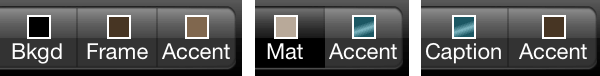 When you press one of the toolbar color icons, the color picker appears, including a title swatch that indicates which color you are choosing.
As you modify the current color selection, the color of the
title swatch and the corresponding tool bar icon both change along with the background, frame, mat or caption itself.
You can quickly select from a palette of sixteen useful colors, use the palette as a starting point and then modify the selected
color, or mix your own color.
When you press one of the toolbar color icons, the color picker appears, including a title swatch that indicates which color you are choosing.
As you modify the current color selection, the color of the
title swatch and the corresponding tool bar icon both change along with the background, frame, mat or caption itself.
You can quickly select from a palette of sixteen useful colors, use the palette as a starting point and then modify the selected
color, or mix your own color.
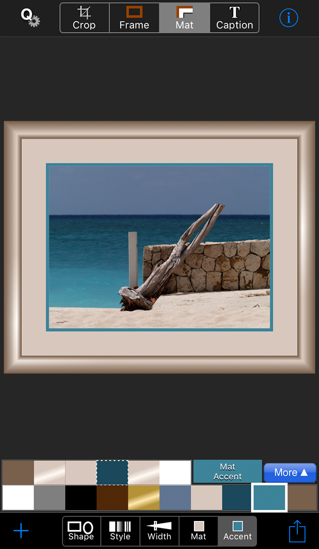
The five colors in the lower left are useful colors that are always in the palette: white, gray, black, brown (or a checkerboard that represents transparency when choosing a background) and metallic gold. The five colors in the lower right are colors that are prominent in the current image. 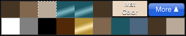
The six colors at the beginning of the top row are the current frame, frame accent, mat, mat accent, caption and caption accent colors. The color you are currently changing is outlined with a dotted line and doesn't change while the color picker is active, so you can touch it to undo a change. So in the image above, the mat color is active. When the color picker was opened, the mat was beige, but a lighter beige color has now been mixed, as indicated by the title swatch color. The frame is dark brown, the frame accent is light brown, the mat accent and caption are both a dark, metallic, teal, and the caption accent is brown. 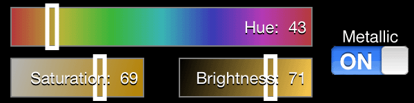
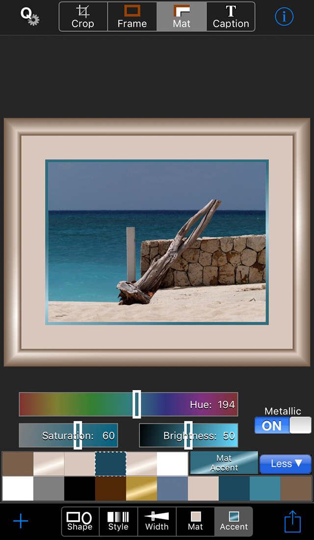
If you want to modify a color you've chosen from the palette, or simply mix your own color, press the More button. Three sliders will appear, with the starting slider values corresponding to the selected color. Then you can use the sliders to modify the color, making it brighter or darker, more or less saturated (vivid), or changing the hue. If you want a shiny color, turn on the metallic switch. When you are finished, you can press the Less button to restore the full image view. Tips: The palette is created based on the image as currently cropped, so you can change the palette by changing the crop rectangle. You can use the six currently selected colors to create harmonious color schemes. For example, choose a mat accent color that matches the frame color, or mix a darker or lighter version of the frame color to use as the mat color.
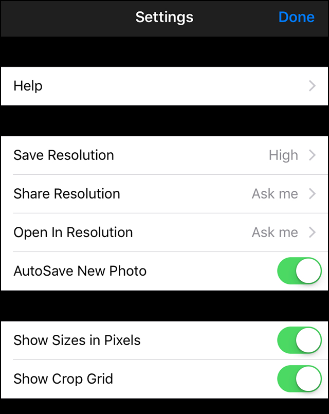
If you want to maintain your original image resolution, choose High. This will preserve the full resolution image, which is your original image, unscaled, minus any area that you cropped out, plus any frame and/or mat (so the final image may be larger or smaller than the original). Higher resolution images take longer to save, longer to email, longer to upload, and use more space on your device, so don't save or share more than you need. Medium resolution is half the full resolution, and Low resolution is 640 x 640 or less, depending on the aspect ratio of your image. When sharing and opening in other apps, note that the service or app that you share with may also scale your image to conform to its resolution requirements. When AutoSave New Photo is on, the uncropped, unframed version of photos that you shoot in Crop'n'Frame will be automatically saved. When Show Sizes in Pixels is on, the cropped, framed image dimensions will be displayed below the Crop Constrain switch, and the frame and mat widths will be displayed below the corresponding sliders. These values are reported at full resolution. The Show Crop Grid switch setting determines whether a 3 x 3 grid is drawn while the crop rectangle is being positioned. |
 |
 | |
 | |
 | |
 | |
 | |
 | |
 | |
 | |
 | |
 | |
 | |
 |
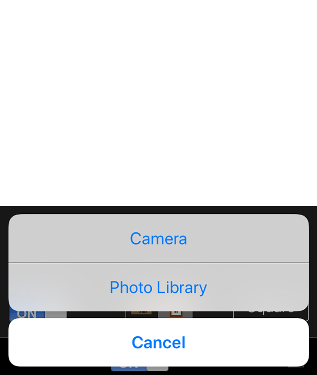
 Tap the plus at any time to open an image from your photo library or shoot a new photo with the camera.
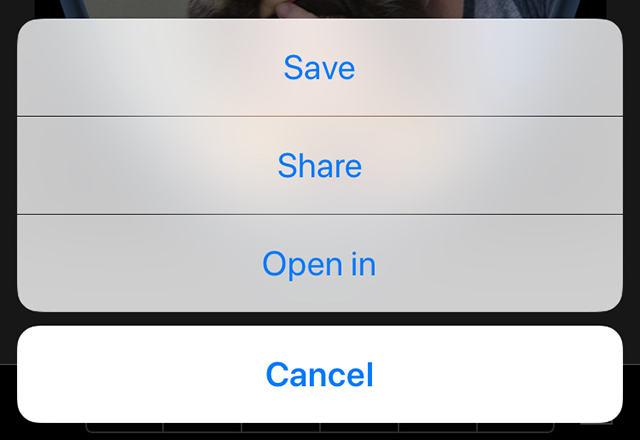
 Tap the up arrow at any time to save or share the current image or to open it another app. Options include Air Drop, Message, Mail, uploading to Facebook or Twitter, sending to another app such as Instagram, and copying to the clipboard.
Images are saved and shared according to your
Tap the up arrow at any time to save or share the current image or to open it another app. Options include Air Drop, Message, Mail, uploading to Facebook or Twitter, sending to another app such as Instagram, and copying to the clipboard.
Images are saved and shared according to your 
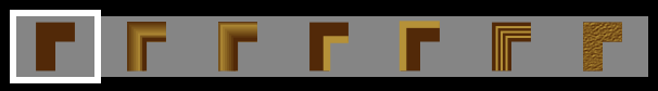 The first style is drawn with only the main frame color, whereas the other styles also use the frame accent color. When you select the last style, a list of textures for you to choose from will be displayed.
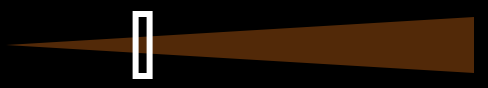 If you want the slider to display the actual width in full resolution pixels, go to the
|
Copyright ©2009-2018 FreshAir Software Inc. All rights reserved. |